Quick Accessibility Wins for Modern Web Apps
Practical, engineer-focused accessibility improvements you can implement immediately, covering semantic HTML, keyboard interactions, focus management, ARIA usage, and color contrast to strengthen the accessibility foundations of any modern web application.
Introduction
As engineers, it's easy to prioritize performance tuning, UI polish, and shipping new features while accessibility quietly falls down the backlog. But the reality is that many high-impact accessibility improvements take only a few minutes to implement and immediately make your application more usable for a much wider audience.
This post focuses on practical, engineering-friendly accessibility wins you can apply to any modern web application. From replacing generic div wrappers with semantic HTML, to improving keyboard navigation and ensuring meaningful labels and focus states, these small adjustments can significantly elevate your app's accessibility, without requiring major refactors or slowing down your delivery pace.
Why Accessibility Matters
Accessibility isn't a compliance checkbox, it's about making your UI work well in all the ways people use it, whether that's a mouse, keyboard, touch, or assistive tools. In practice, this leads to fewer edge cases, clearer interactions, and a more stable, reliable interface overall.
Small improvements, like meaningful labels, predictable focus movement, and clear focus states directly benefit users who rely on screen readers or keyboard navigation. While these changes may not drastically change the experience for mouse or touch users, they make your code more structured, semantic, and easier to maintain, which helps engineering teams build more predictable and reusable interfaces.
How to Check if Your App Is Accessible
There are several tools and techniques to quickly assess accessibility in your app:
-
Browser tools: Chrome extensions like axe DevTools and Lighthouse analyze your app and generate reports with actionable recommendations.
-
Screen readers: On macOS, VoiceOver can be enabled with Command + F5 or via System Preferences → Accessibility → VoiceOver. Navigating your app with VoiceOver and the keyboard helps identify issues with focus management, keyboard navigation, and ARIA labels.
Quick Accessibility Wins
1. Use Semantic HTML
A frequent accessibility problem is overusing generic div or span elements instead of semantic HTML. Semantic elements communicate meaning and structure to assistive technologies, which improves navigation for screen readers, enhances keyboard interactions, and makes focus states more predictable. Beyond accessibility, semantic HTML also helps search engines and improves maintainability of your code.
Key examples:
- Interactive elements: Use
<button>for actions,<a>for links, and<form>for forms, rather than repurposingdivorspan. This ensures proper keyboard behavior and screen reader announcements automatically. - Page structure: Use
<header>,<footer>,<nav>,<main>,<section>,<article>,<aside>,<details>,<summary>,<dialog>elements to give meaning to sections of your app. - Main content: Each page should have one
<main>element containing the primary content. This allows screen readers to skip directly to the core content and avoids confusion in page navigation. - Grouping and labeling: Use elements like
<fieldset>and<legend>for form groups and<label>for form inputs to provide context and improve usability.
By relying on semantic HTML, you offload much of the accessibility work to the browser and assistive technologies, reducing the need for custom scripts or ARIA overrides. It also makes your code more readable and maintainable, especially in larger projects with complex UI components.
2. Use Heading Levels Correctly
Headings provide the structural hierarchy of a page and correct heading usage improves content navigation, comprehension, and accessibility.
Best practices:
- Single
<h1>per page: Each page should have one<h1>element representing the main page title. This helps screen readers identify the primary topic. - Visually optional
<h1>: One some pages like dashboards, analytics panels, or pages where the content layout already makes the main purpose clear, the<h1>may not add visual value. In these situations, it can be visually hidden (e.g., using CSS techniques like sr-only) so that it remains available to screen readers without affecting the page layout. - Hierarchical order: Follow a logical order with
<h2>,<h3>, etc., to indicate subsections. Avoid skipping levels (e.g., jumping from<h1>to<h4>), as this can confuse assistive technologies. - Descriptive headings: Headings should clearly describe the content of the section they introduce. Avoid generic titles like "Section 1" or "Details".
- Navigation benefits: Screen reader users can navigate content by jumping between headings, so a well-structured heading hierarchy significantly improves their experience.
Proper heading structure also benefits SEO and maintainability, making it easier to understand and update content in large applications. Combined with semantic HTML, headings form the backbone of an accessible and well-structured page.
3. Keyboard Navigation
Keyboard navigation is one of the core pillars of accessibility. If your app can't be used with a keyboard alone, it becomes partially or entirely unusable for users who rely on keyboard input or assistive technologies that emulate it.
Focusable interactive elements:
All interactive elements like buttons, links, inputs, selects, checkboxes, radios, toggles, and custom interactive components must be focusable. The user should always be able to move focus using Tab, Shift + Tab, and arrow keys when appropriate.
Visible focus states: Every focusable element needs a clear, visible focus indicator. This is how keyboard users track where they are on the page. Avoid removing the outline unless you replace it with an equally visible custom style. Focus states are especially important for components that are heavily used: navigation links, form controls, dropdown triggers, modals, and interactive widgets.
Keyboard-first behavior (not hover-only): Critical UI should never depend only on hover interactions. Patterns like dropdown menus that open only on hover or tooltips that reveal essential information on hover are not accessible. All important actions must be reachable and usable via keyboard.
Logical tab order: The tab order should follow the visual reading order in almost all cases. This creates predictable navigation and reduces user confusion. There are rare exceptions where deviating from the visual order improves usability. For example, in a modal footer, the primary action (e.g. "Submit") should come first in the tab sequence, even if visually positioned after a secondary action like "Cancel."
Skip to main content:
It's helpful to provide a "Skip to main content" link as the first focusable element on the page. This link can be visually hidden by default (with sr-only) and become visible on keyboard focus using :focus-visible in CSS. It allows keyboard and screen reader users to bypass repetitive navigation and jump directly to the main content area.
4. Describing Images
Accessible apps rely on meaningful text descriptions to convey information that visual elements provide. For images, the alt attribute is how screen readers communicate the purpose or content of an image. Writing good alt text ensures that users who cannot see the image still receive the same information.
Tips for writing effective alt text:
- Decorative images: If an image is purely decorative (e.g., visual separators, background images, icons etc.), set the
altattribute to an empty string (alt=""). This tells screen readers to skip it and reduces unnecessary noise. - Informative images: When an image conveys information or context, use a short descriptive text. Avoid generic labels like "image" or "picture". Communicate only what is relevant to understanding the content or action.
- Keep it concise: Alt text rarely needs to describe every visual detail. Focus on the purpose or essential information, what the user needs to know to understand the UI or content.
- Don't repeat the image type: Screen readers already announce the element type (e.g., "image"), so you don't need to include words like "photo of…" unless it meaningfully changes the context.
- Context matters: The same image may require different alt text depending on where it appears. For example, logo in the header might use
alt="Company name"because it acts as a brand identifier but in the footer, it should have empty alt text in most cases as it's only decorative and doesn't add any meaningful information.
5. Links Should Have Meaningful Descriptions
Every link should clearly describe its purpose or destination. Meaningful link text helps users, including those navigating via screen readers, understand what action will occur before activating the link.
Guidelines:
- Text links: Ensure the link text is descriptive and conveys the destination or action ("Download Annual Report" instead of "Click here").
- Non-text links (icons/images): When links use only icons or images, provide a textual alternative using
aria-labeloraria-labelledby. This allows screen readers to convey the link's purpose even without visible text. - Avoid repeating links unnecessarily: Each link should clearly describe its destination. If the same destination appears multiple times nearby, make sure each link still makes sense on its own.
- Be consistent: Use clear, descriptive link text throughout your app so users know what to expect when they navigate.
6. Improve Readability with Proper Color Contrast
One of the quickest accessibility wins is ensuring that text and UI elements have sufficient contrast against their backgrounds. The color contrast ratio measures how much a foreground color stands out from a background color, ranging from 1:1 (no contrast) to 21:1 (maximum contrast, e.g., black on white). Higher contrast improves readability for users with low vision, color vision deficiencies or when viewing screen in bright environments.
Understanding WCAG contrast levels
The Web Content Accessibility Guidelines (WCAG) define two main contrast levels to ensure readability:
- AA (minimum standard):
- Normal text: contrast ratio ≥ 4.5:1
- Large text (≥18px or ≥14px bold): ≥ 3:1
- AA is achievable in most apps and considered the practical standard.
- AAA (enhanced standard):
- Normal text: contrast ratio ≥ 7:1
- Large text: ≥ 4.5:1
- AAA is stricter and recommended for text-heavy apps, apps for older users, or applications containing critical information like medical or legal content.
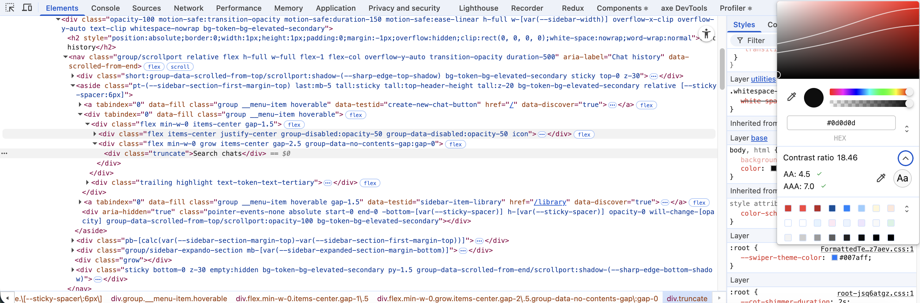
Checking contrast
Use Chrome DevTools to check the color contrast of elements:
- Inspect the element you want to check.
- In the Styles panel, click the color swatch.
- The color picker will display the contrast ratio between the foreground and background colors (example in the image below).
Ensuring proper contrast is a small change that dramatically improves readability and accessibility without impacting your design workflow.
7. Use Announcements and Live Regions for Dynamic Content
A lot of modern UIs update content without a full page reload like toasts, form errors, loading states, success messages, or new data appearing after an action. While these are obvious visually, screen reader users won't notice them unless you explicitly announce the change.
This is where ARIA live regions help:
- Use
aria-live="polite"for non-urgent updates like loading states or info messages. - Use
aria-live="assertive"only when the user must hear the update immediately (used sparingly for critical errors etc.). - For toasts, inline errors and status updates, placing them in a live region ensures the screen reader reads them automatically.
Conclusion
Accessibility doesn't have to be complicated or time-consuming. By applying these quick wins like semantic HTML, proper headings, keyboard-friendly navigation, descriptive images and links, and sufficient color contrast, you can make your app usable for a wider audience while improving code quality and maintainability.